VieMed requests a website with updated information, structure, and design.
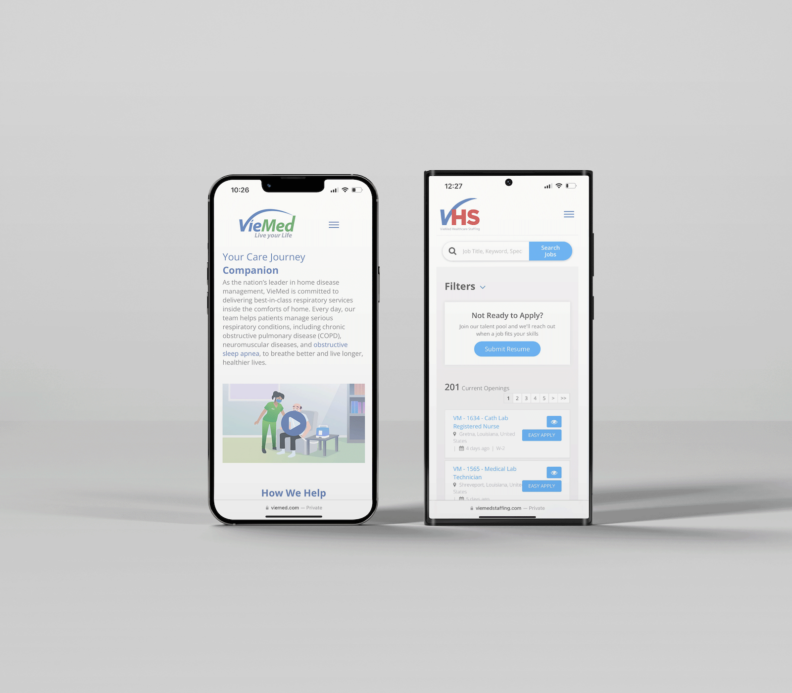
Viemed specializes in providing in-home treatment through clinical practitioners who offer therapy and counseling to patients. With an audience that includes elderly individuals with COPD, their caregivers, and healthcare providers, the website needed to feel fresh, trustworthy, and simple to use.
You can visit this site live at viewed.com. The VHS (VieMed Healthcare Services) website has since been rebranded, and no longer displays this layout.
PROBLEM
The original VieMed site had outdated content, broken contact forms, and confusing navigation, leaving users unsure where to go for help. Our goal was to rebuild the experience around clarity, accessibility, and care.
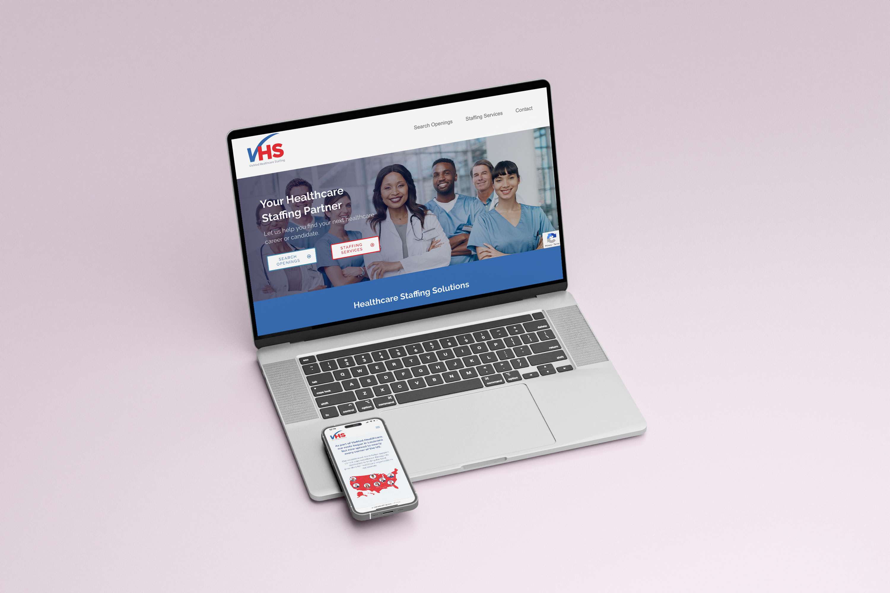
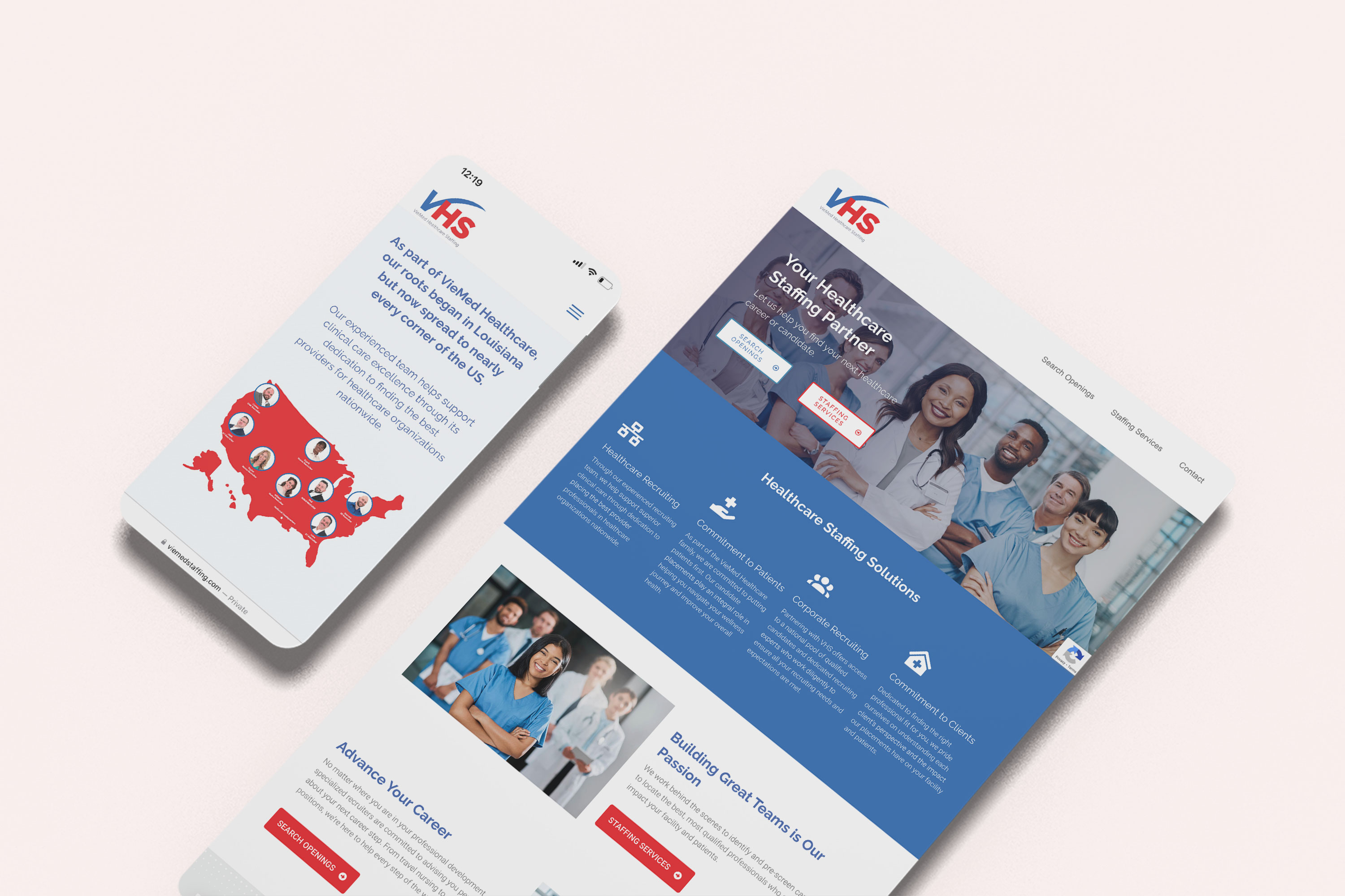
VieMed Healthcare Staffing also needed a website that functioned as a recruiting platform for nurses and in-home care providers working with ventilator patients.
SOLUTION
The goal was to create a more user-friendly website for older patients using Viemed’s products, while also resolving backend issues and giving the site a modern, refreshed look.
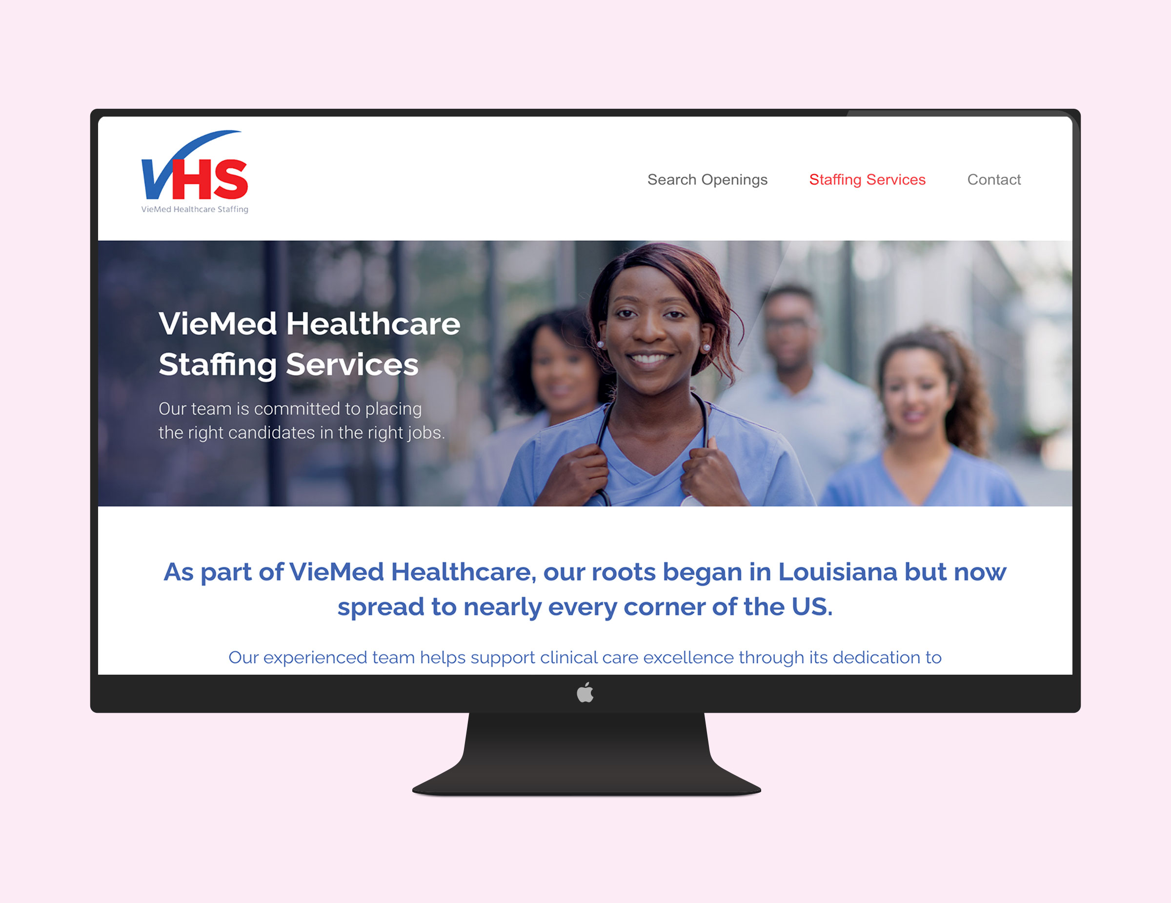
For VieMed Healthcare Staffing (VHS), the objective was to design a smaller sister site that visually aligned with Viemed’s brand but focused primarily on job listings and recruitment.
We began the project with a comprehensive audit of Viemed’s existing website to evaluate its structure, content, and overall user experience. This process helped us identify outdated information and navigation challenges that made it difficult for users to find what they needed. The audit served as a foundation for understanding how the site was performing and where improvements were most needed.


CUSTOMER AUDITS
After the website audit, we reviewed user feedback collected from customer support calls and previous complaints left on our site feedback survey. This feedback highlighted the need for clearer navigation, more visible support options, and up-to-date content, all of which directly informed our design priorities and site structure. By mapping this feedback against our website audit, we were able to prioritize the most impactful design changes addressing user needs and pain points.
Some of the feedback we received was:
RESEARCH CONCLUSION
The site functions as a central hub, with Viemed as the primary focus. To accommodate three distinct user groups, I organized each department under Viemed into clearly defined pages: Respiratory, Sleep, Behavioral, Connected Health, Staffing Services, and Managing Your Disease. This structure provides users with an intuitive way to find the equipment, resources, or services relevant to their needs.

Once the designs were finalized, we collaborated closely with an outsourced development team to bring the new site to life. Over the course of nine months, we iterated on pages, tested functionality, and ensured that the final product was both visually cohesive and fully aligned with user needs.
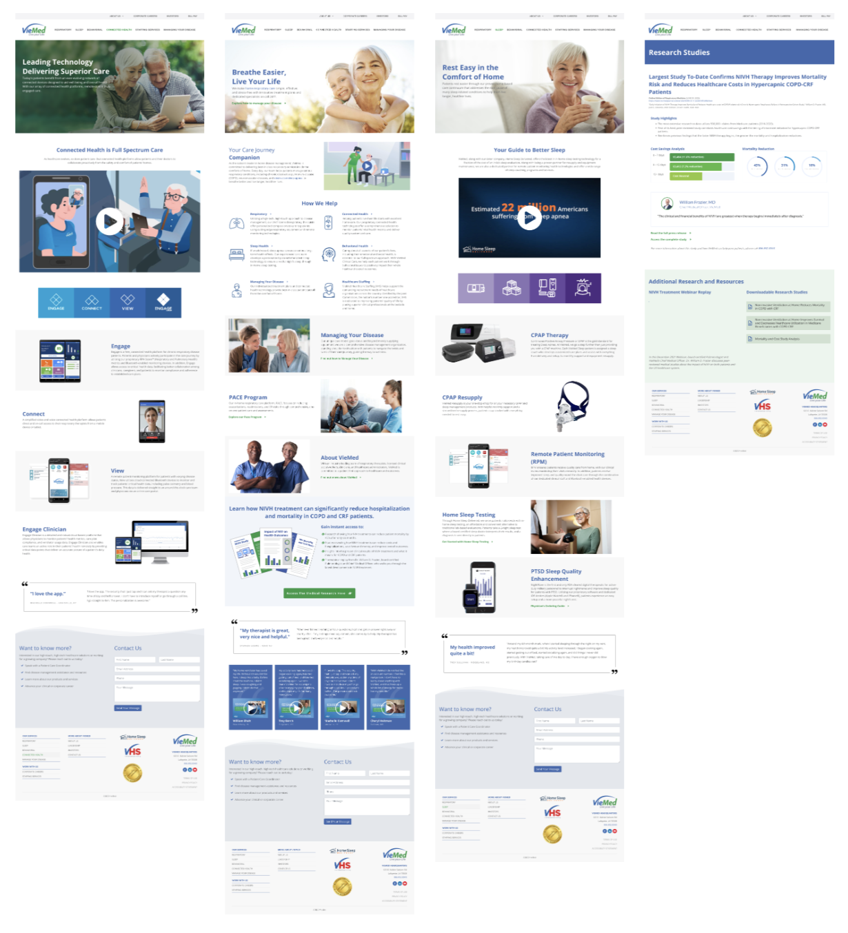
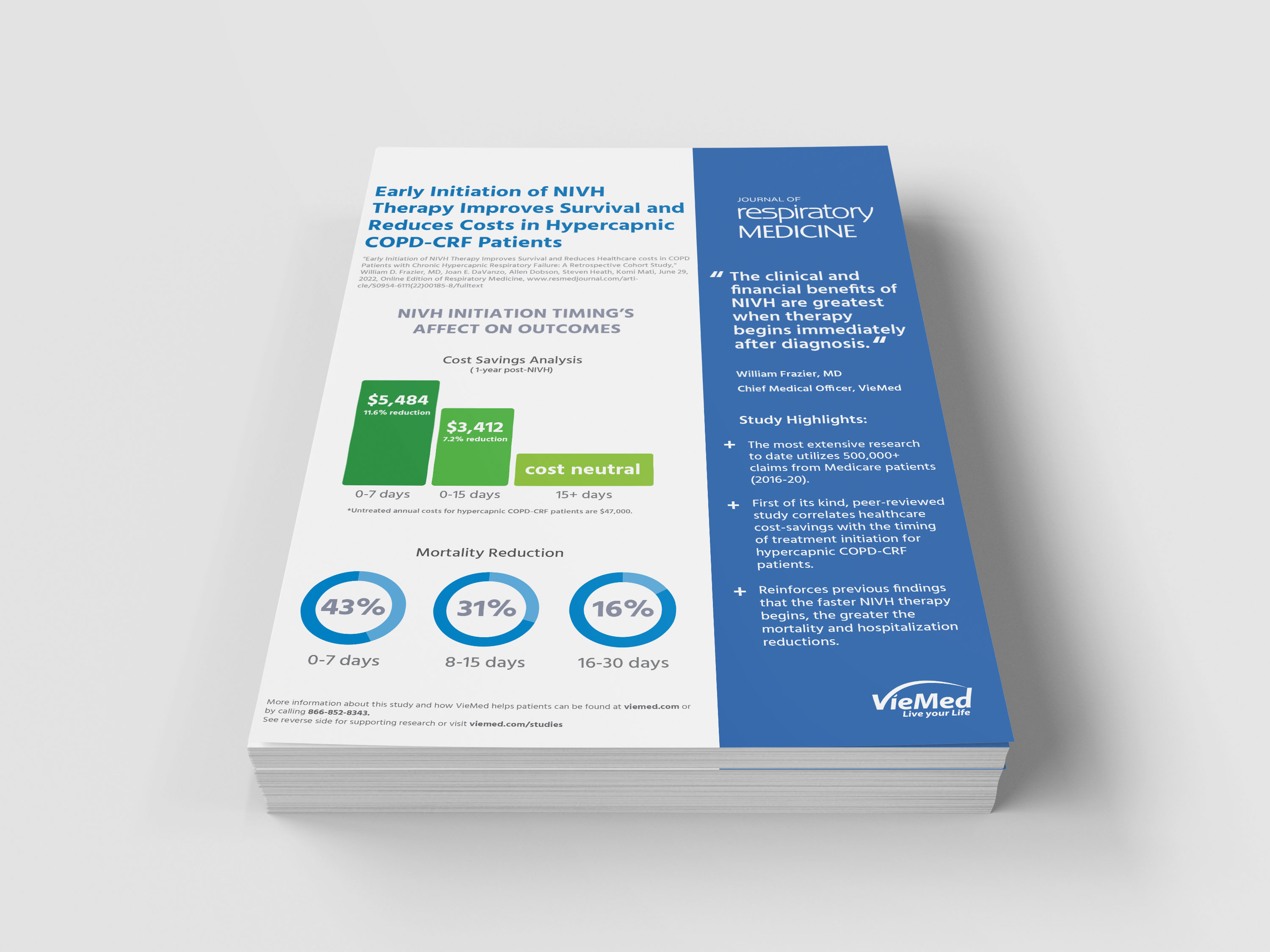
During the site design process, I also designed new marketing materials that aligned with the site’s new design, including email reminders for PAP supply reorders.


This site was developed on a four-month timeline alongside the larger Viemed website redesign. The primary goal was to create a streamlined experience for healthcare professionals seeking nursing positions through Viemed’s staffing services. While user interviews were not approved for this project, their feedback could have provided valuable insights to further enhance usability during the design phase.
WEBSITE STRUCTURE
Building this site was a straightforward process that required only a few key pages to be effective. Given the short launch timeline, we focused on creating a clean, intuitive layout with simple navigation. Since the site’s primary purpose was staffing, integrating job-posting engines quickly became both an essential and exciting part of the build.
Both the Viemed and Viemed Healthcare Staffing projects provided valuable experience in designing for accessibility, clarity, and real-world healthcare needs. Through research, collaboration, and iterative design, our team delivered solutions that simplified complex information and improved user trust across both platforms. While each project had unique challenges—from navigating government and healthcare compliance to working within tight launch timelines—the outcomes reinforced the importance of thoughtful UX strategy and clear communication in every stage of design and development.
LEARNINGS
NEXT STEPS