Transforming CMS Cloud with a new brand identity, updated website infrastructure, and user-centered design improvements.
The Centers for Medicare & Medicaid Services (CMS) requested a full rebrand and website infrastructure overhaul for their CMS Cloud platform. The project deliverables included a new website design and a comprehensive branding kit featuring a logo, visual guidelines, and supporting brand assets.
My responsibilities included developing the new brand logo and assets, translating the refreshed visual identity into the website design, and conducting user testing to validate the usability and functionality of the new site infrastructure.
PROBLEM
In 2024, CMS Cloud’s website had begun to feel outdated and difficult to navigate for users. Many reported challenges finding key information, confusion around site structure, and frustration with outdated content on important pages. Additionally, CMS Cloud wanted to modernize its sub-branding to better reflect its evolving role while still maintaining visual and thematic alignment with its parent organization, CMS (Centers for Medicare & Medicaid Services).
SOLUTION
Our goal with the rebrand was to revitalize the CMS Cloud website by creating a modern and user-friendly experience. We focused on simplifying navigation, refreshing the visual identity, and building a flexible system that allows the CMS Cloud team to easily update critical information. Our objective is to ensure the site remains accurate, accessible, and consistently aligned with the broader CMS brand.
Our first step in understanding the site’s infrastructure was conducting a comprehensive audit of the existing CMS Cloud website and interviewing both current and prospective users about their experience.
Our findings were:

BRAND NAMING WORKSHOP
As we built the new website infrastructure, we partnered closely with the CMS Cloud team through a series of branding workshops to gain a deeper understanding of their evolving brand identity and future vision.

BRANDING SKETCHES
With the new name (CMS Hybrid Cloud), I began exploring visual directions through a series of logo sketches and early concept designs. I presented the first round to stakeholders in a collaborative review session, where they shared feedback and voted on their preferred concepts through a survey.

Incorporating stakeholder insights, I refined the strongest ideas through two design rounds, ultimately arriving at the final logo that best represented the CMS Hybrid Cloud brand.
FINAL LOGO
The final logo includes a modern cloud, representing the platform’s collaborative and hybrid nature. Using a palette of light blue, yellow, and dark blue, the design blends clarity and optimism with the professionalism of the broader CMS brand. Together, the form and color choices create a visual identity that feels modern, fluid, and collaborative.

INITIAL BRANDING GUIDE
Once the final logo was complete, I moved on to creating the CMS Cloud branding guidelines. Building on the foundation of the existing CMS brand, the guide was designed to maintain alignment with the parent brand’s standards while expressing Hybrid Cloud’s modern and collaborative personality.
Our team iterated through several rounds of high-fidelity website designs, collaborating closely with CMS to ensure the product accurately reflected their vision.
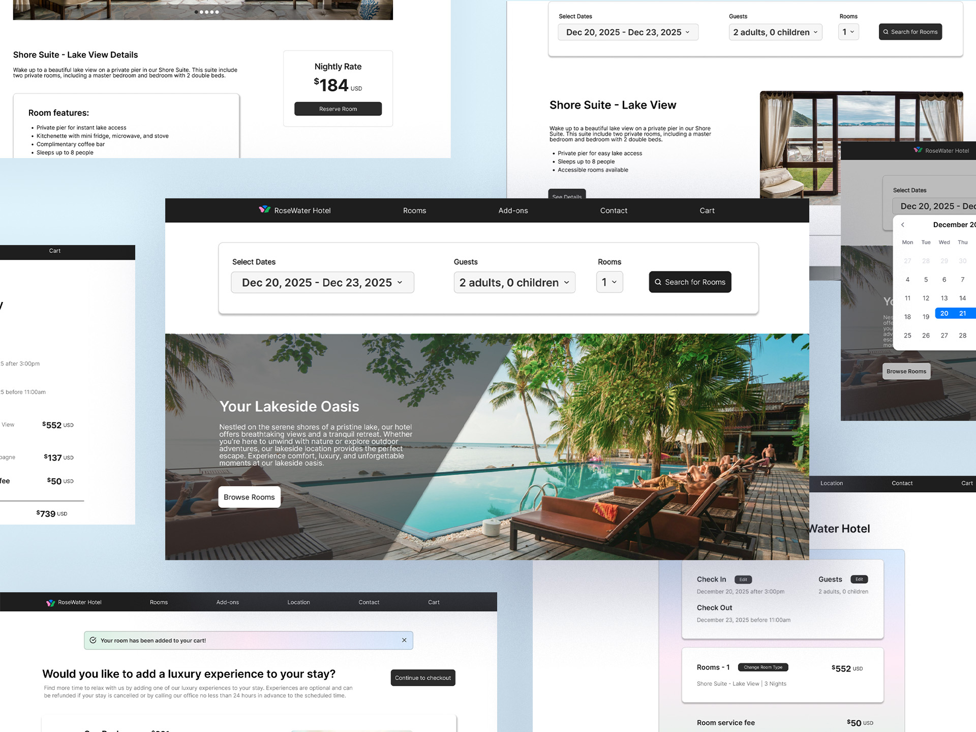
NEW WEBSITE INFRASTRUCTURE
To improve the site infrastructure, key pages were reorganized, and a modular content system was implemented so the CMS Cloud team could update information quickly and consistently. We also optimized page layouts and visual hierarchy, ensuring that critical information was highlighted and accessible, while the design system maintained consistency across all pages.

A total of five users participated in the testing, including four ADOs and one IUSG Advisor. Each participant was asked to complete a series of tasks across three distinct user flows. During the study, we evaluated both their success in completing the tasks and their overall satisfaction with the design and usability of the Hybrid Cloud website.
Some of the findings from this study were:


This study provided valuable insights into user interactions and perceptions of the new Hybrid Cloud website:
Despite the early termination of the project due to government contract renewals, this study provided a useful analysis of the new site's usability and design improvements.
.jpg)