My process started off with research to understand user mental models and detect usability issues within current hotel booking processes. Qualitative and some quantitative data was gathered through competitive analysis and a usuability study consisting of two participants. The data was analyzed through a card sorting and usability issues were identified. This data was then implemented into a user flow to visualize the areas of the process that had the most usability issues. A solution was then developed through analysis of this data, and a prototype was created and tested with another usability study.
COMPETITIVE ANALYSIS
I chose 4 very different hotels to get an understanding of industry trends and recurring themes in the booking process without limiting that experince to price range or status. I analyzed four hotel chains including Doubletree, The Ritz-Carlton, The Great Wolf Lodge, and Kimpton Blythswood Square Hotel.
I recorded these observations using a color key:
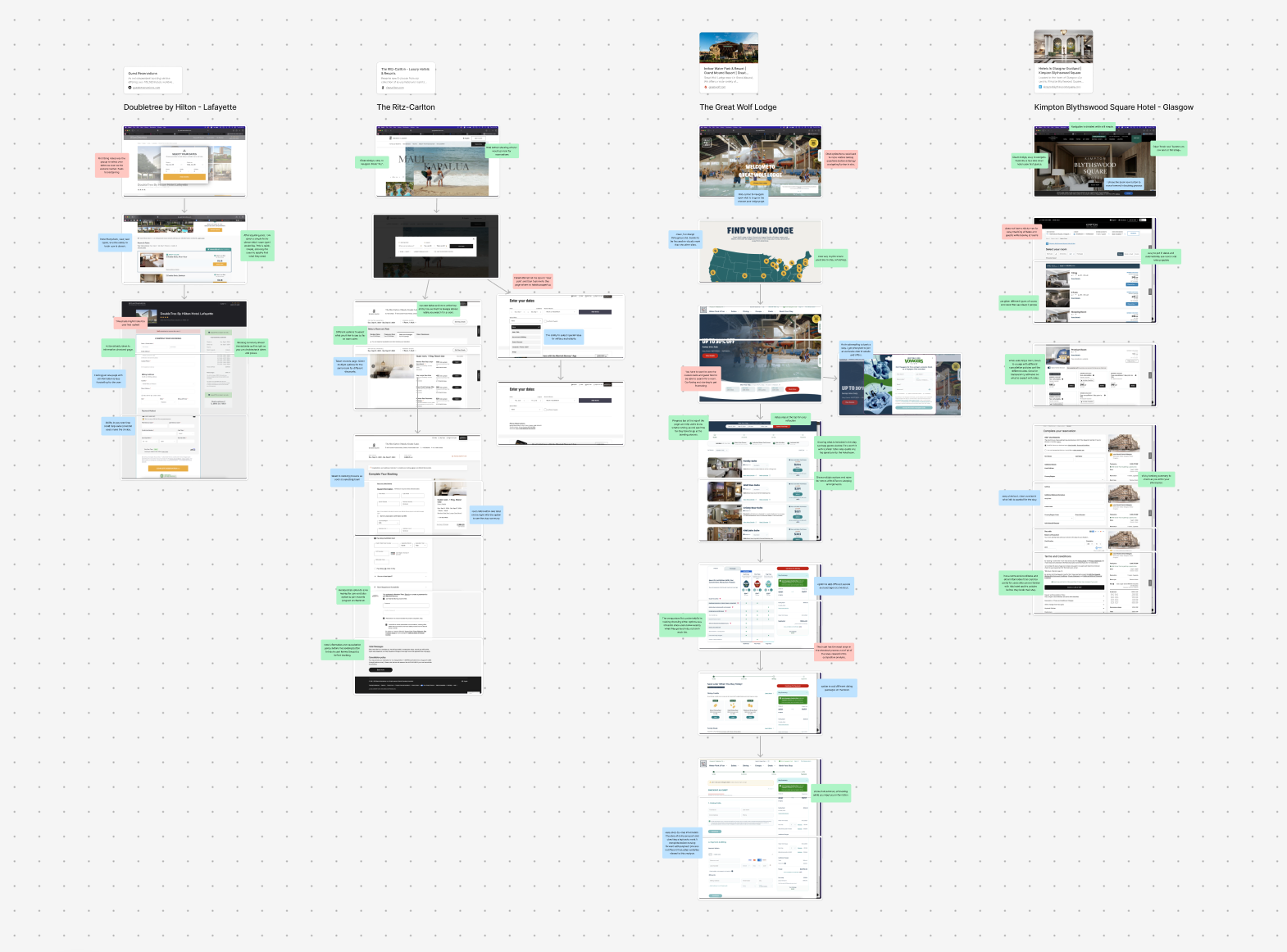
Through this research, I concluded that the most common best practices were:
INTERVIEWS
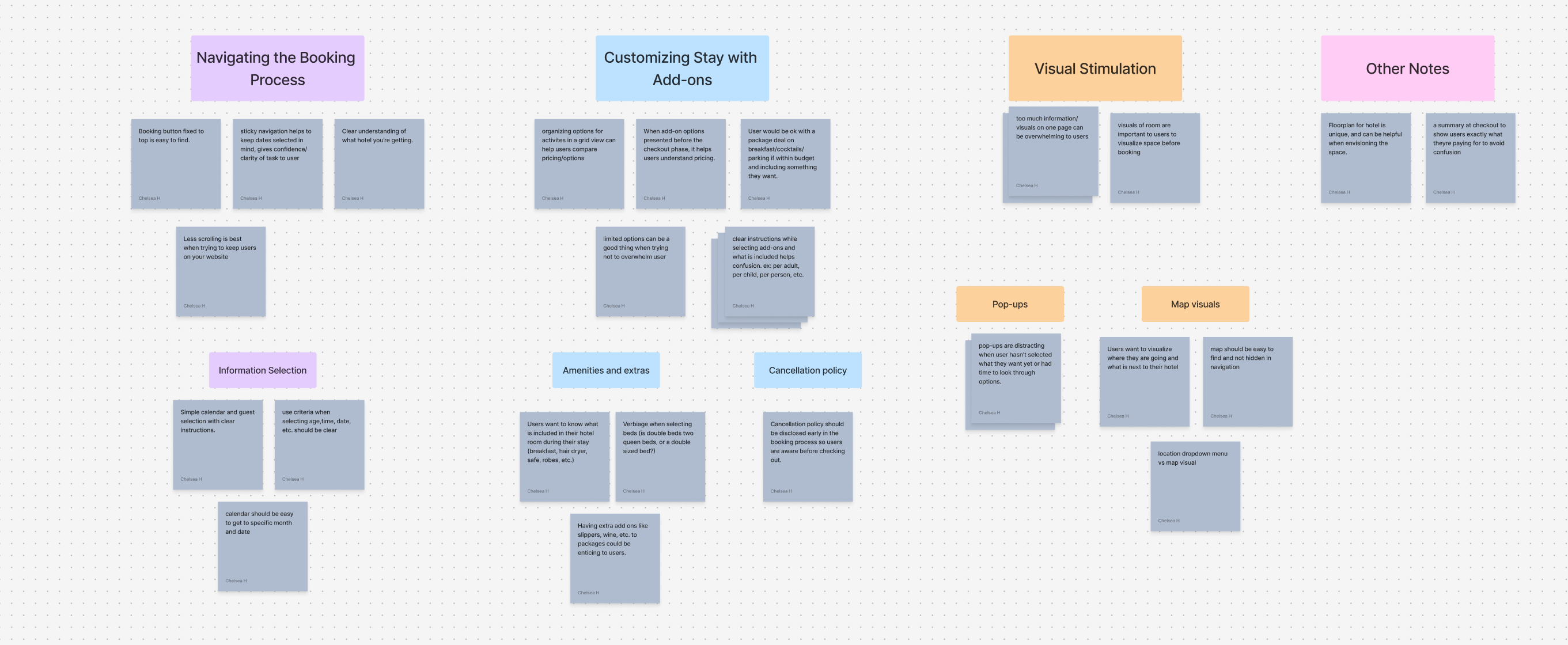
Next in the process i recruited two users to participate in a competitive analysis user study. For these studies, I had asked participants go through three of these websites and to describe their thoughts and feelings throughout the process. Each study lasted approximately 60 minutes. Afterwards, I added each participant's feedback into sticky notes and sorted them into groups based on common themes.
Some of the findings were:
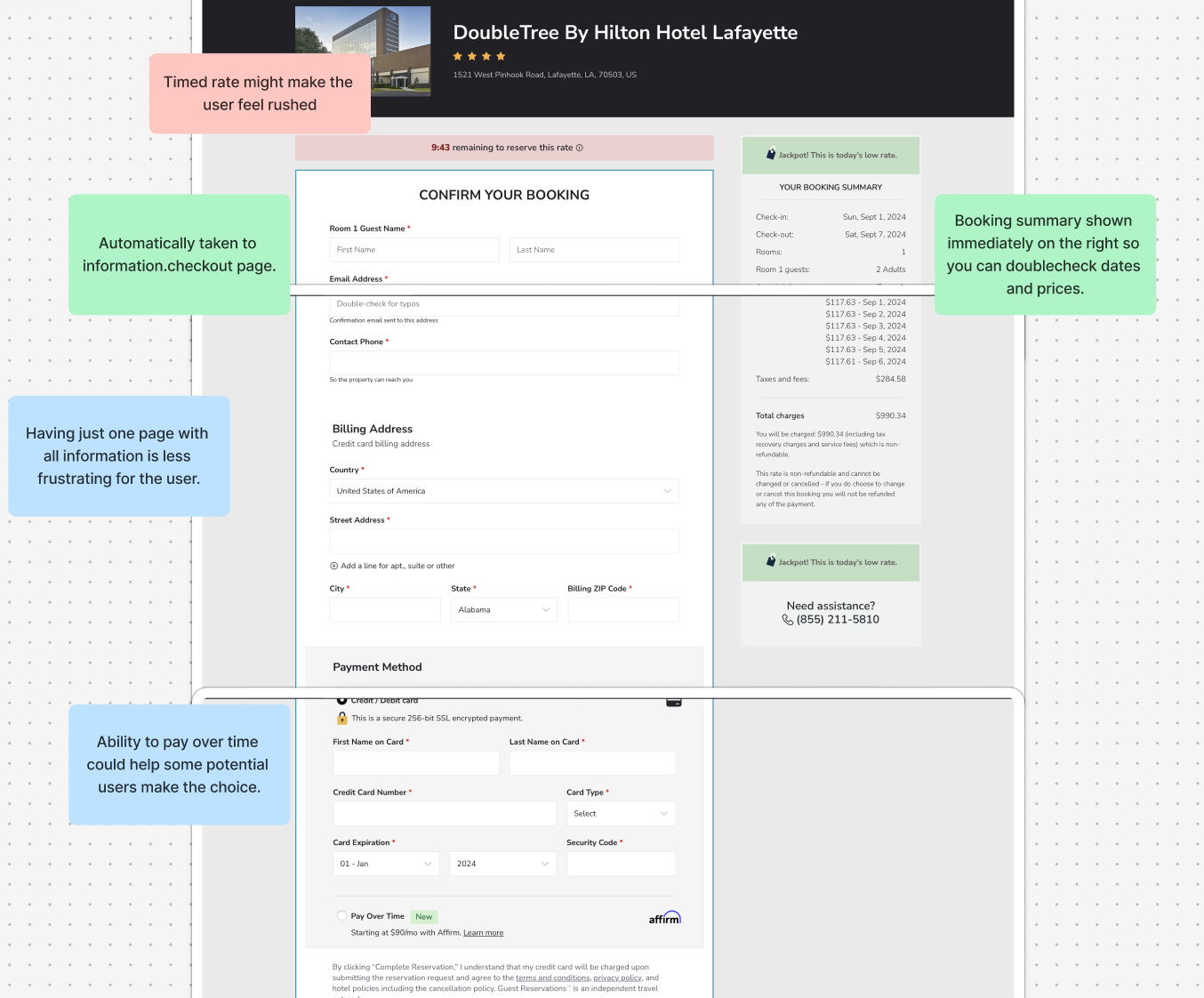
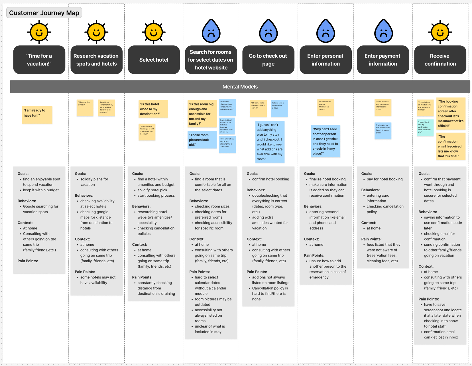
After initial research, I created a customer journey map that presented the pain points throughout the hotel booking process. Through visual representation and using my notes from the user studies, I confirmed that much of the frustrations within this flow comes from the check out process.
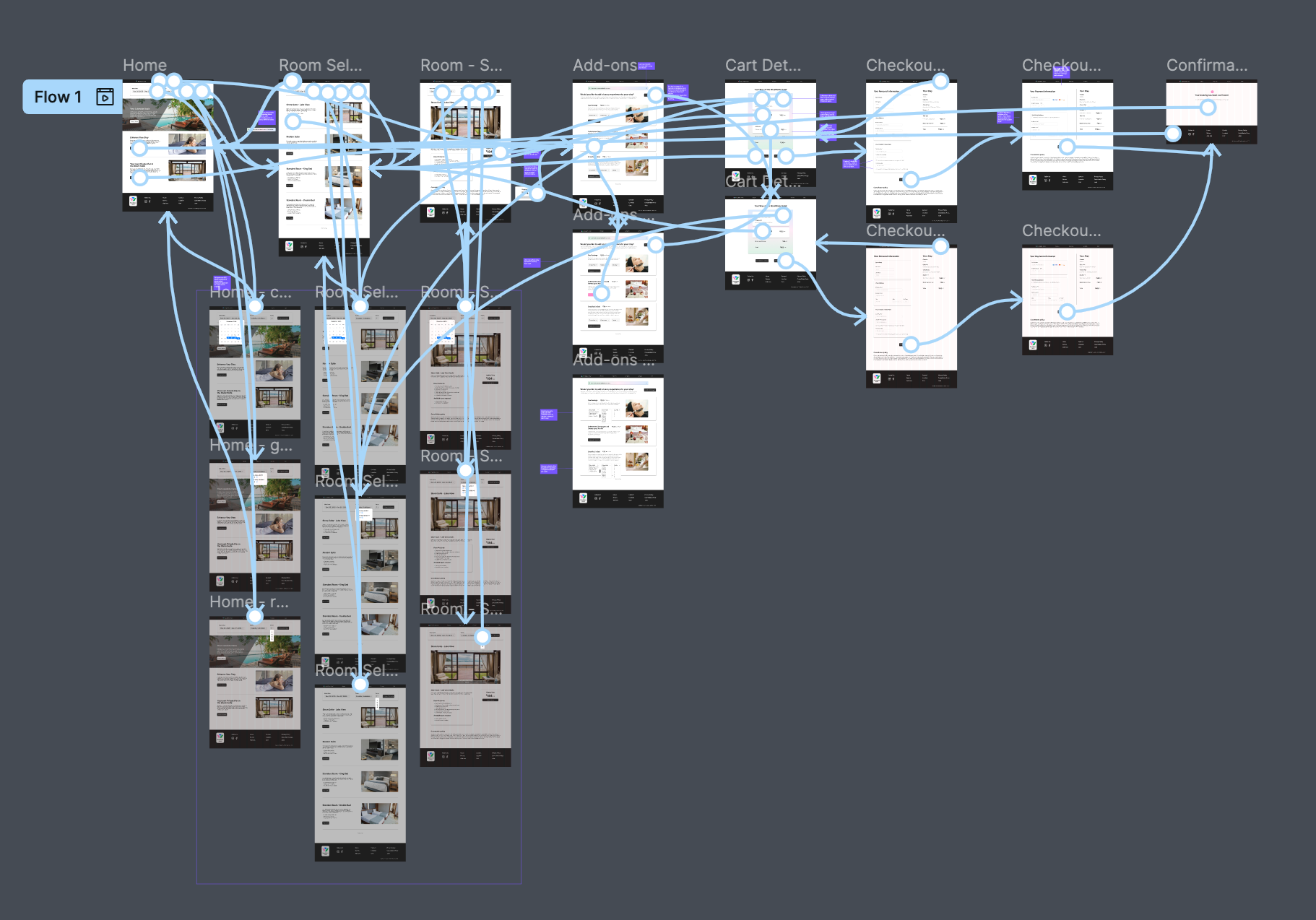
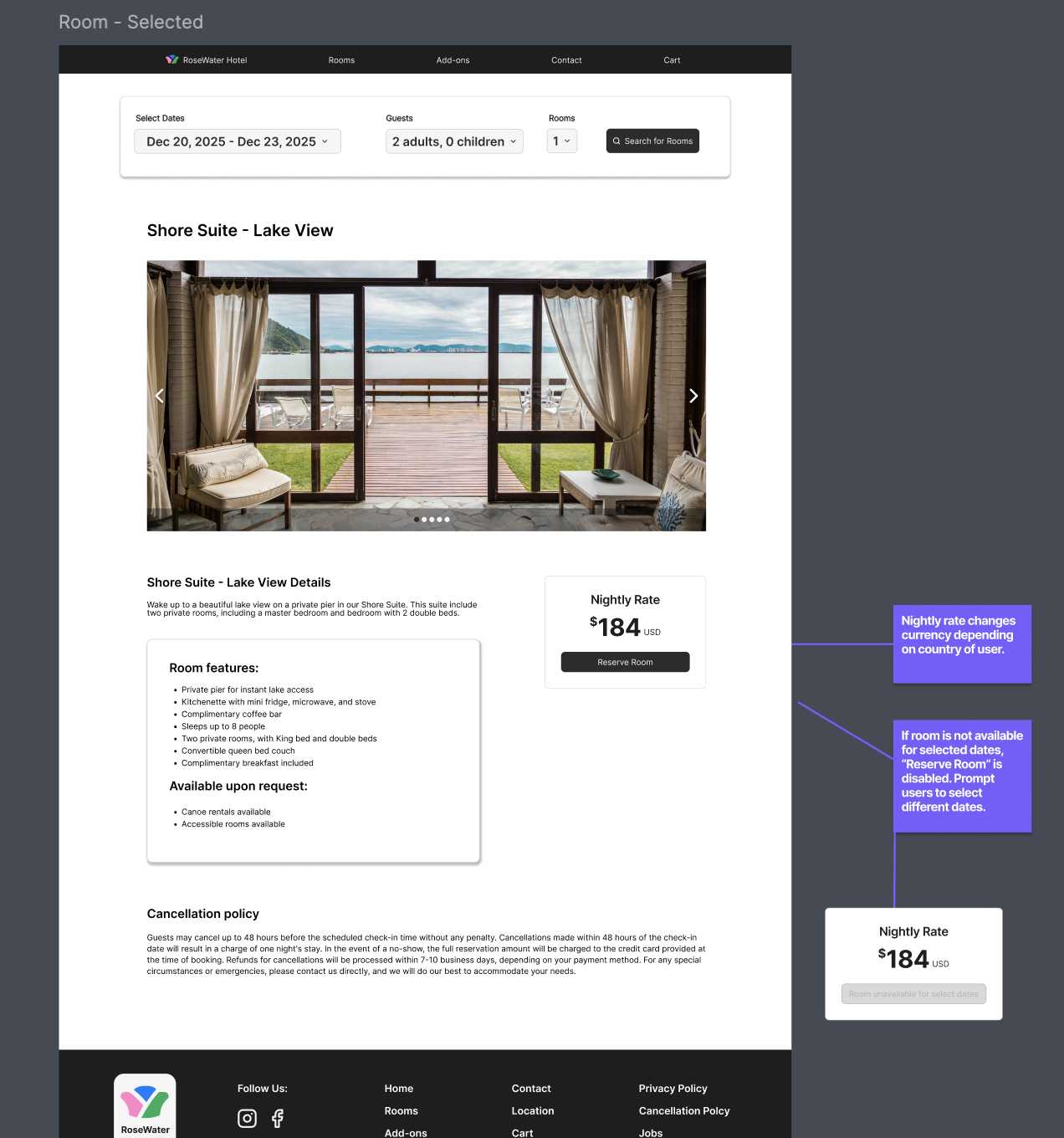
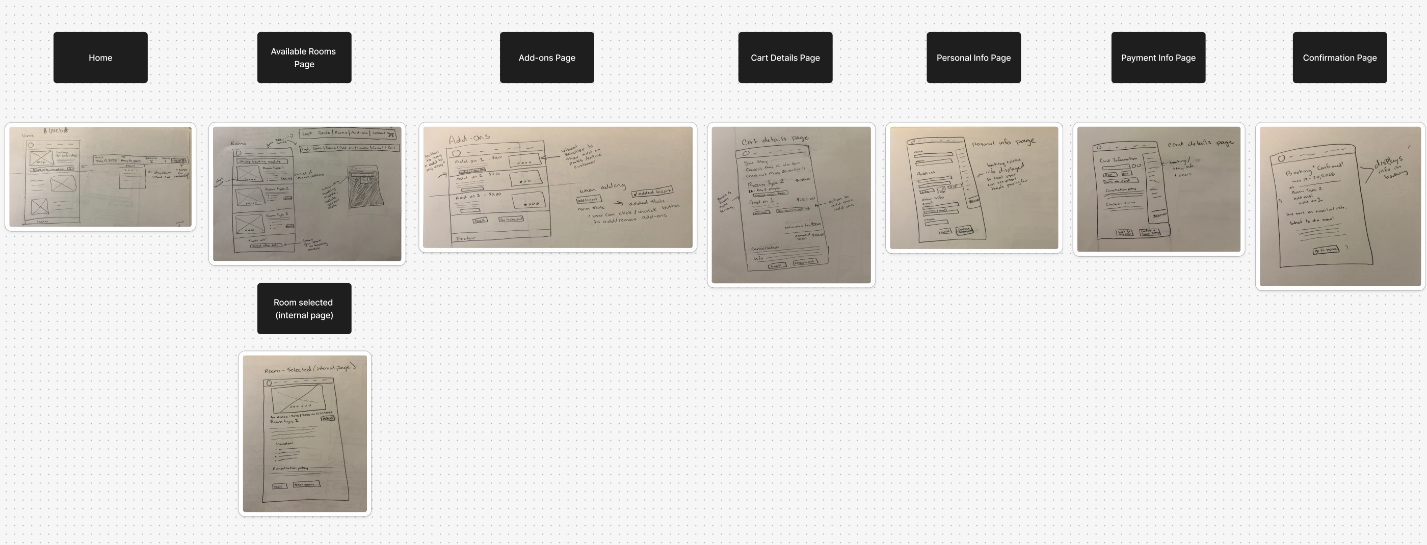
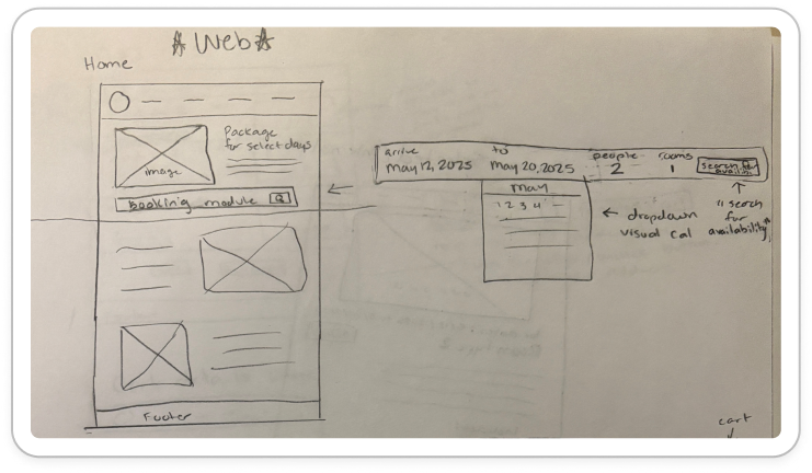
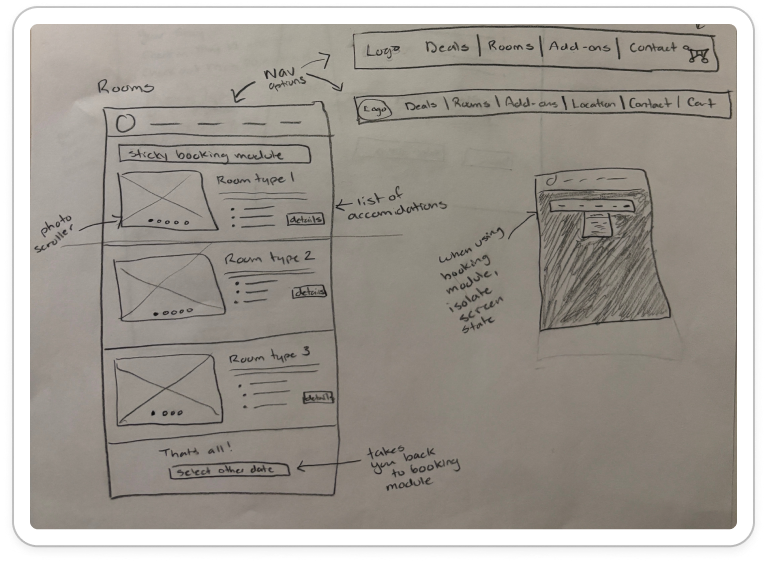
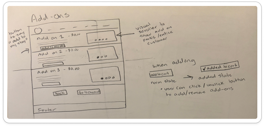
I began the design process with low-fidelity wireframe sketches to accelerate decision-making through visualization. My sketches were based on the initial user interviews and initial findings through competitive analysis, making sure to solve major pain points and make any notes regarding design solutions. I laid out each screen on a figjam board and used these as a guide to create the initial figma prototype.
Some specific ideas I kept in mind throughout this process:
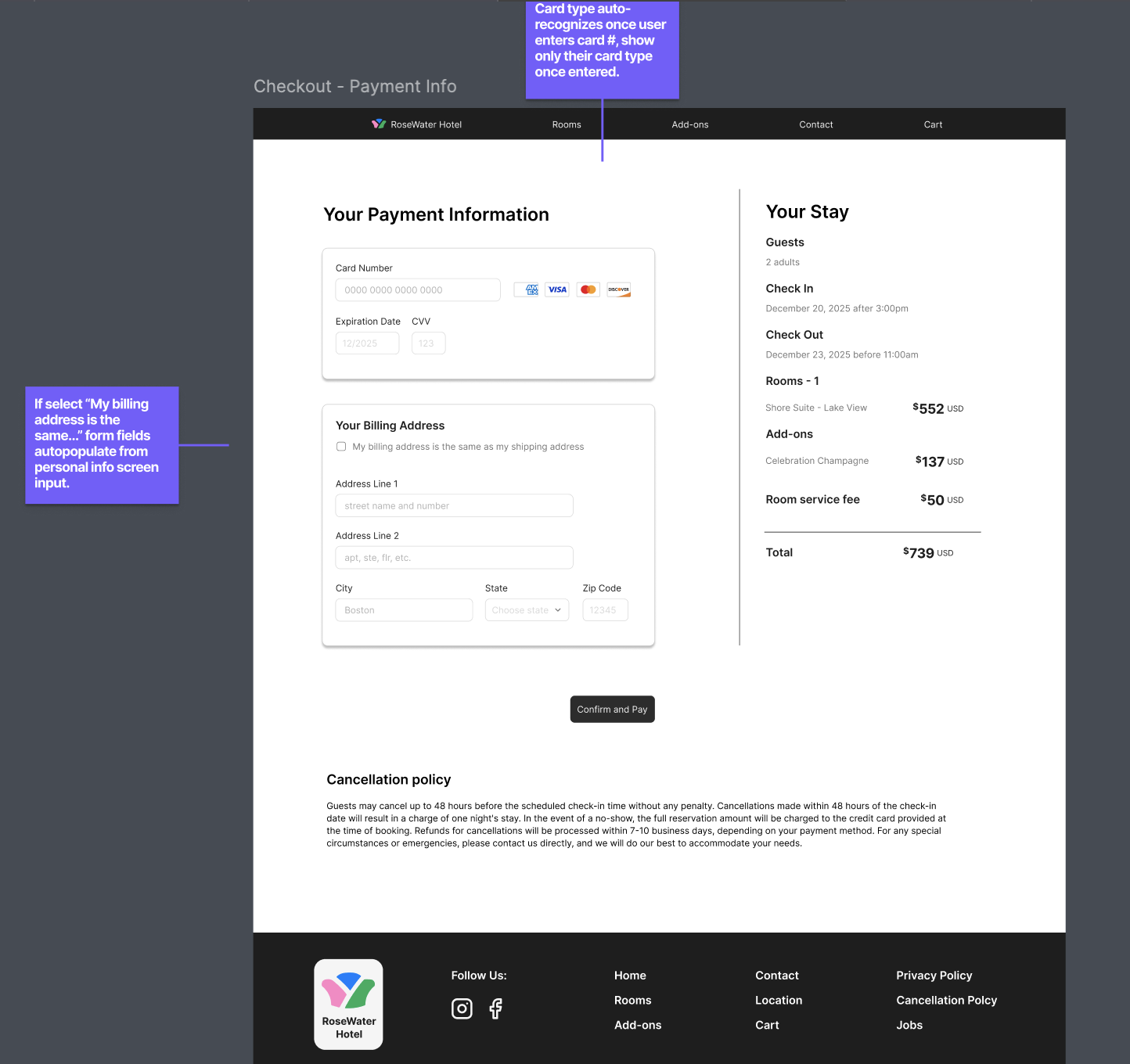
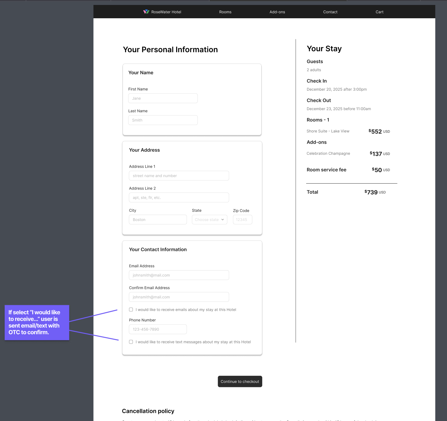
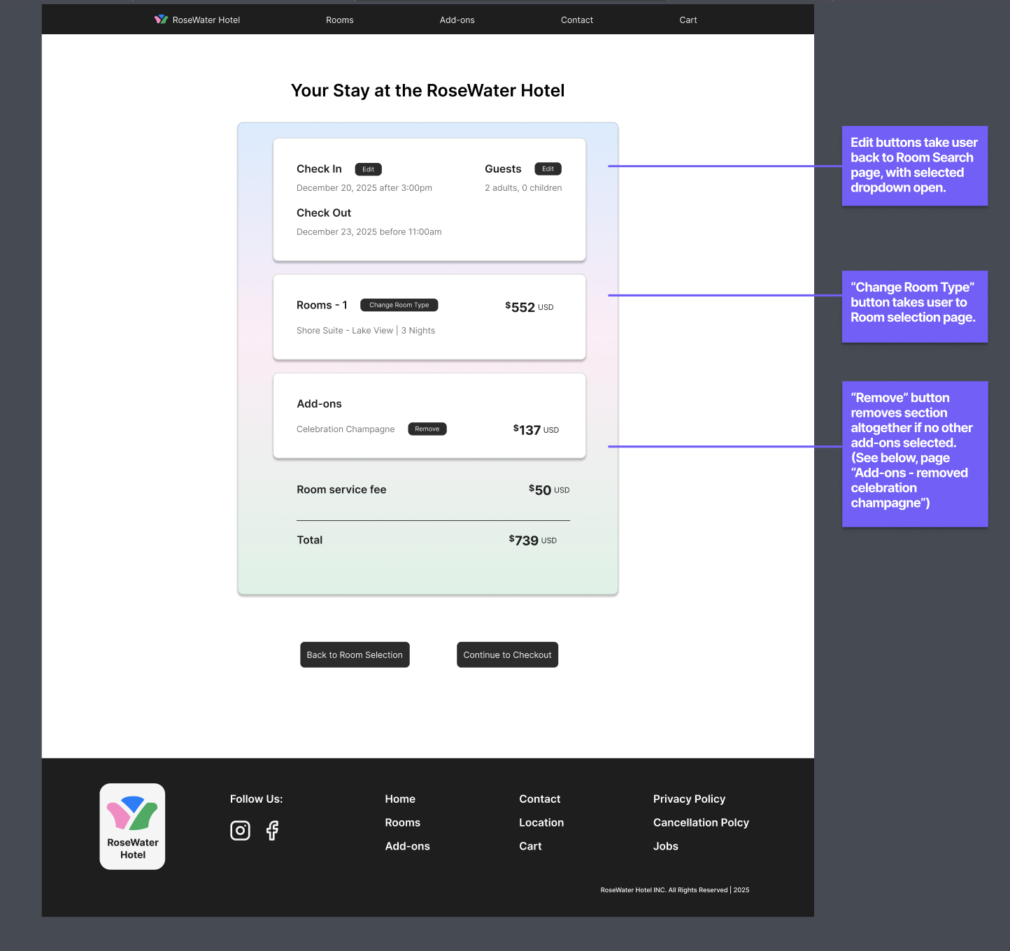
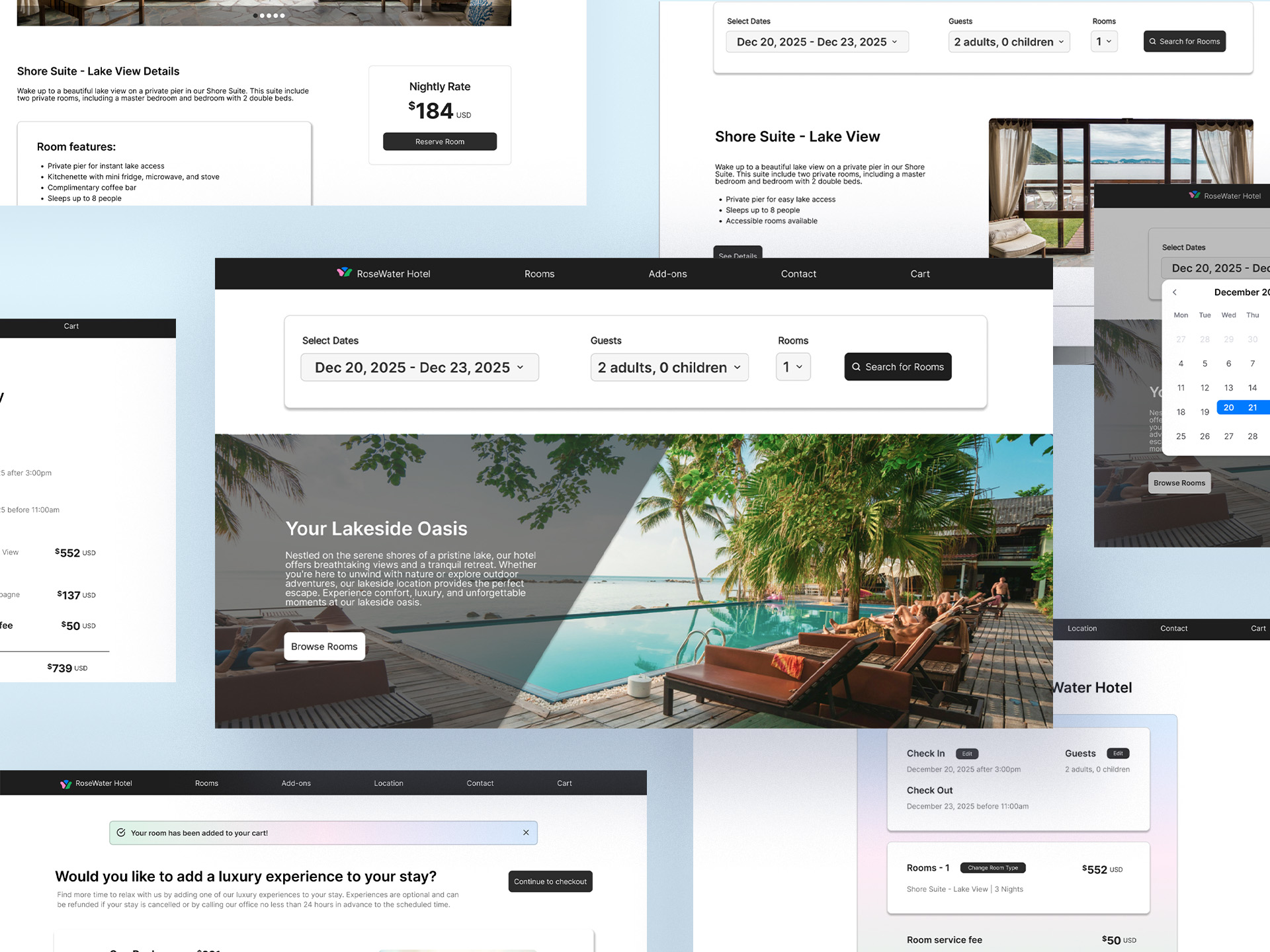
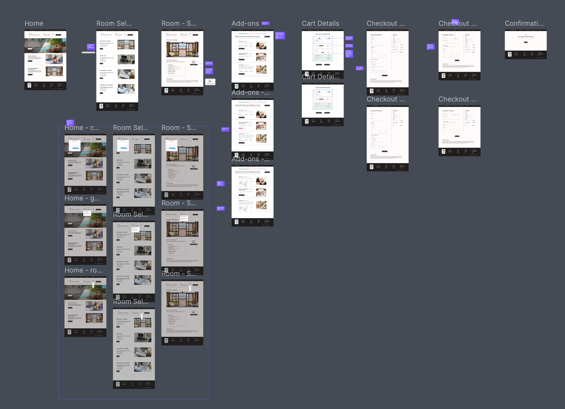
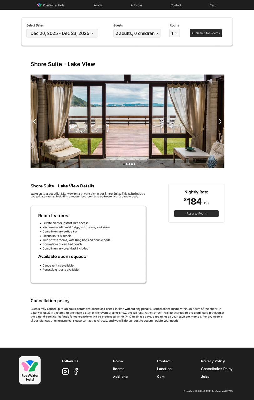
Once the usability issues were resolved, I moved on to design the final screens in Figma. The final design consisted of a high-fidelity prototype with added developer annotations for guidance on transitions and button states. In a separate section, I also created separate screen states with an overlay for when users select the calendar navigation.
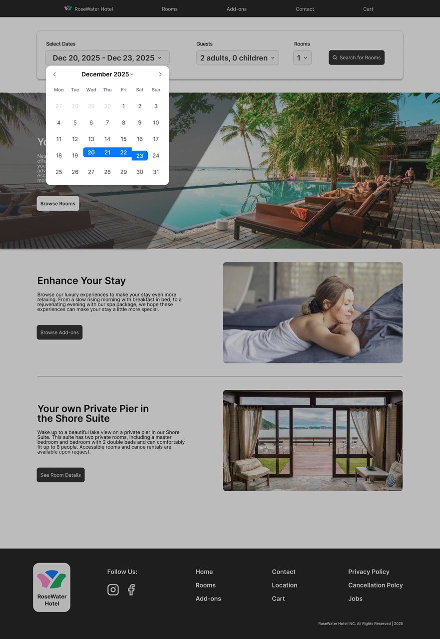
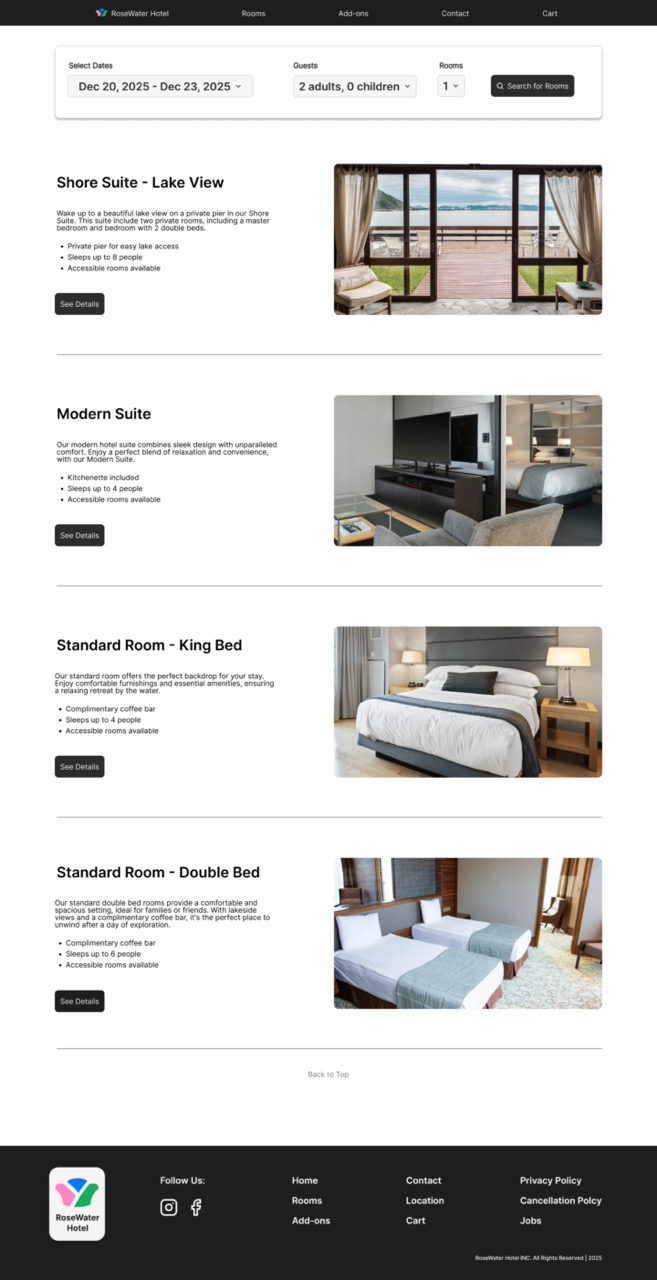
The visuals for this project were minimal. I wanted a clean design with a simple booking process that shows elevated design without distractions. I wanted this site to feel luxurious but reachable. Due to time, I only designed screens for web, but I plan to further develop this design to be responsive on mobile and tablet as well.
After finalzing the design, I created a prototype for testing this new hotel booking checkout flow. Although this project did not go any further, the next steps to continue and finalize this design are to: