Redesigning the user experience of filing property taxes for citizens of Honolulu, HI.
The team at the Real Property Assessment Division (RPAD) identified two major issues with their website: it was difficult to navigate, even for employees, and it generated frequent calls from residents struggling to file property taxes or locate essential information. To address this, I collaborated with my design lead, software engineers, and project manager to significantly improve the user experience, making it easier for both staff and the public to access and file property tax information online.
You can view this project live at www.realpropertyhonolulu.com.
PROBLEM
Users call the RPAD office often, stating that they cannot find information about their specific property tax situations on the site. The RPAD employees want to create a site that exists as a virtual hub, and that can be updated with dates and information easily while making it easier on users to understand and navigate. Users were also getting lost by clicking into pages on the site, and did not know how to find the information they needed.
SOLUTION
Our solution was to create a home page that acted as a hub for frequent uses on the site, including form and fee submission dates, frequently downloaded resources, FAQ, buttons for popular reasons users visit the site, an elevated search system, and other resources. We also simplified the page categories to contain nested information in a tab navigation system to help guide users to their desired resources with less confusion and clicks.
For this project, RPAD did not approve of conducting user testing on the citizens of Honolulu. Our team pivoted to curating user interviews with a sample size of the employees at our company (who live in Honolulu and pay property taxes) and with the team at RPAD. After this initial interview process, we also created a content audit, restructuring the website navigation based on the findings in our research to solve the main issues their customers were facing.
Findings:
CURRENT IA
While conducting the initial interview process, we also performed a comprehensive content audit to document the existing site infrastructure. This involved mapping out the full navigation structure, identifying redundant or outdated pages, and tracking how content was organized across the site. This research helped us understand how users were currently interacting with the website and informed our strategy for restructuring the navigation and content hierarchy.

Based on our findings, we implemented design solutions to address these issues, including:
RESTRUCTURING THE IA
After documenting the original site infrastructure, our team began iterating on a new site map based on user interview feedback. Through multiple rounds of revisions and client input, we landed on the fourth version that grouped related content under clear category pages. We also introduced a side navigation system for internal pages using tabs and accordions, making the site more intuitive and significantly easier to navigate.

While restructuring the information architecture, we began sketching early concepts for the internal pages in a FigJam file, which we shared with RPAD for feedback and alignment. Our first designs for the internal pages incorporated valuable feedback and focused on improving usability by:
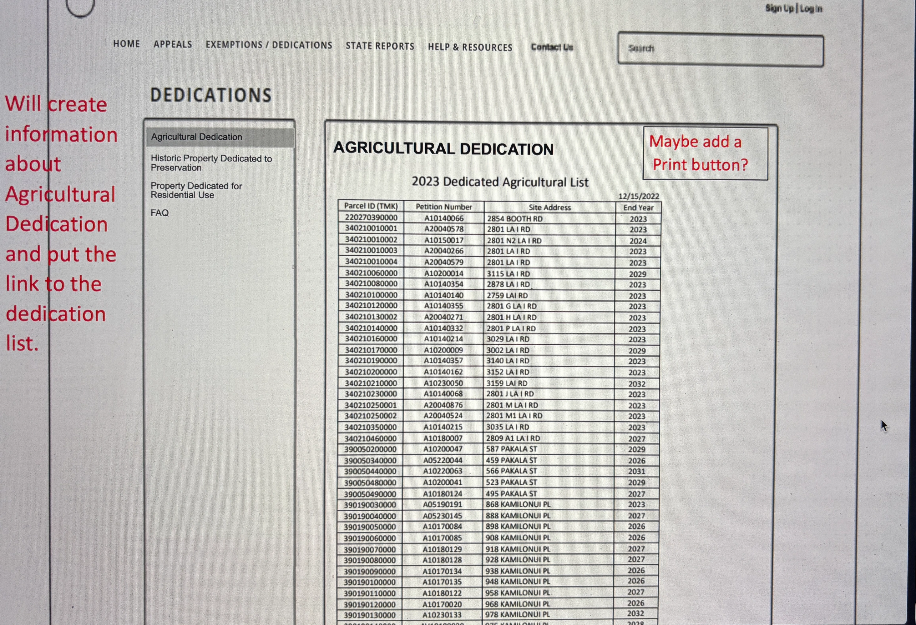
WIREFRAME RESEARCH
RPAD’s feedback, highlighted in red, provided valuable insights on prioritizing key information. This took several rounds of revisions addressing legal requirements and incorporating RPAD’s preferences while adhering to user best practices.


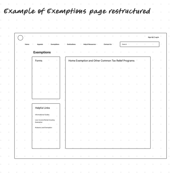
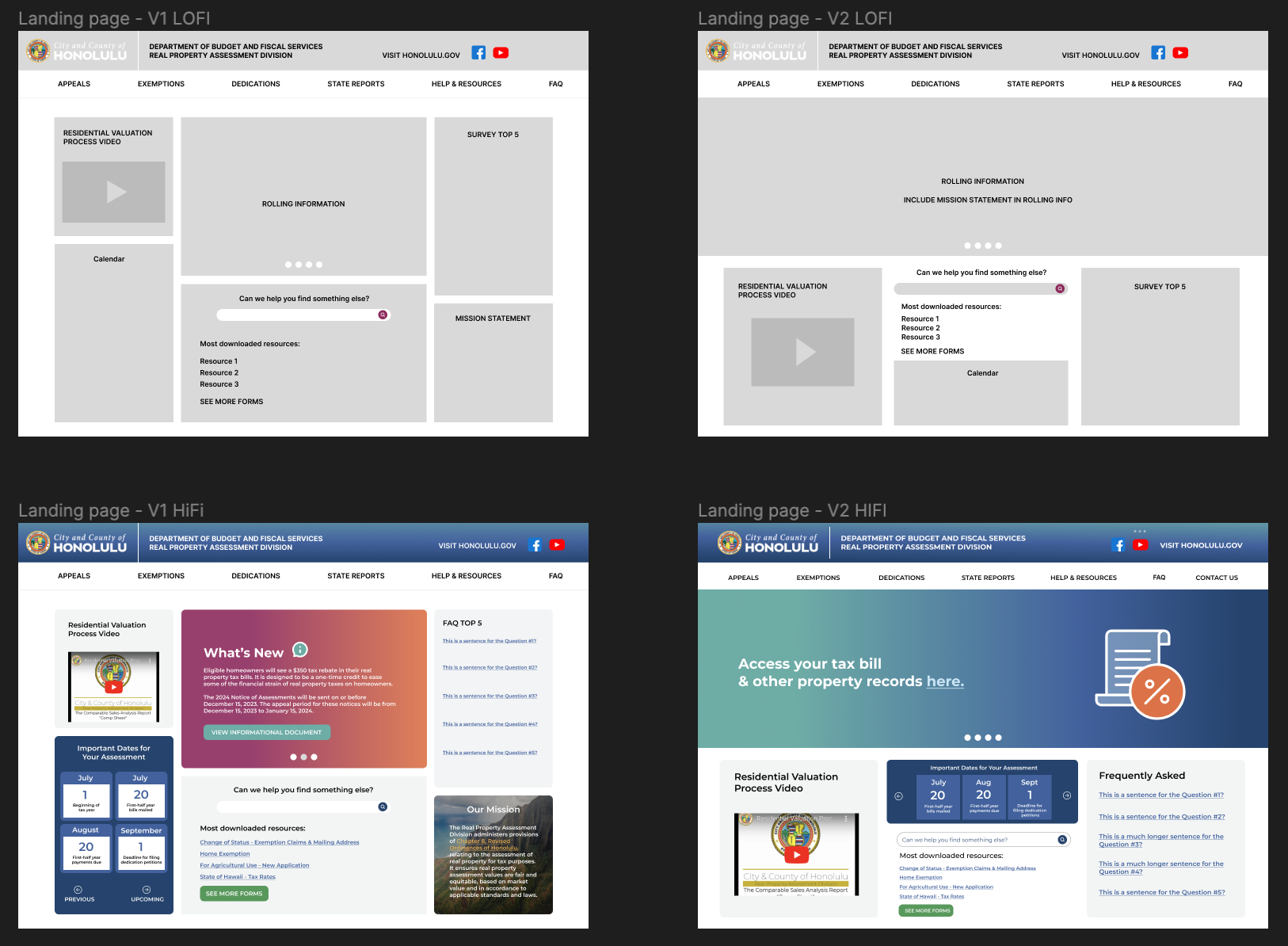
HOMEPAGE INITIAL WIREFRAMES
For the homepage design, the client provided a rough concept centered around using it as a hub for commonly accessed resources. Building on their initial vision and insights from user research, I used Figma to translate the idea into a more intuitive and user-friendly wireframe.
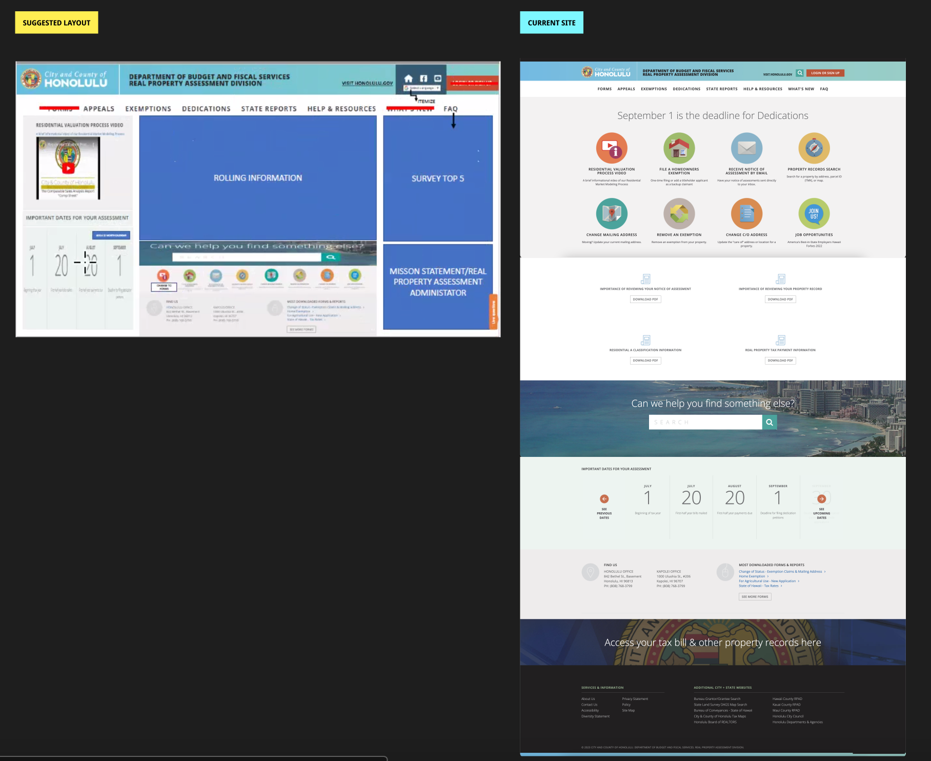
HOMEPAGE
In the initial wireframes, we focused on usability and accessibility by incorporating the following elements:
HI-FI WIREFRAMES
To ensure a consistent and accessible experience across all devices, I designed responsive wireframes for desktop, tablet, and mobile in Figma. Key design considerations included:
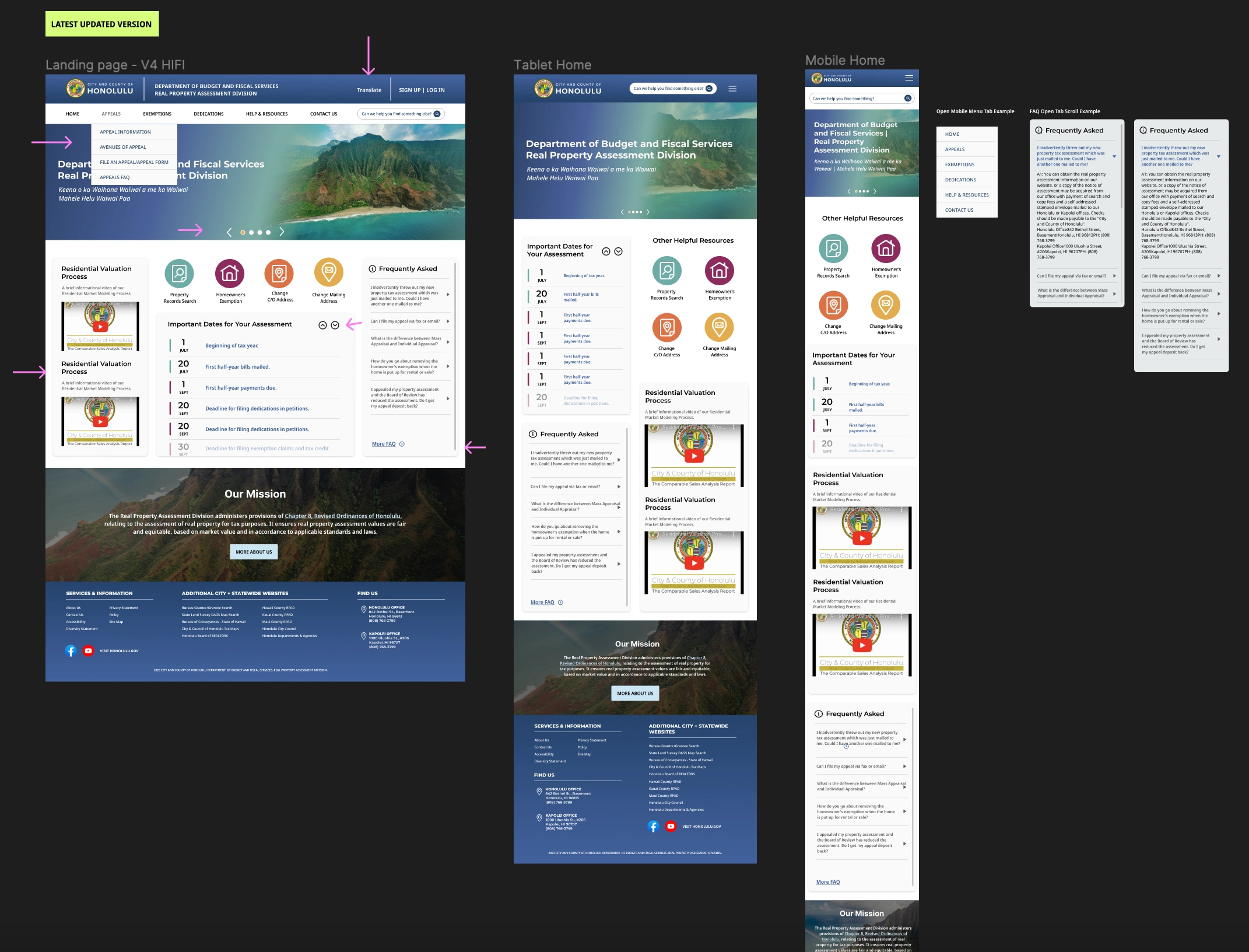
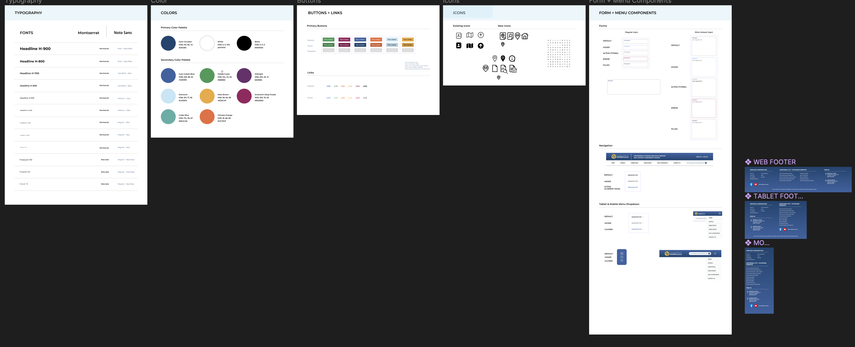
I also built a UI library using RPAD’s brand colors and continuously updated it as new components and styles were developed. To meet 508 compliance while preserving RPAD’s white logo, I used their dark blue brand color for the navigation bar and footer designs, ensuring both accessibility and brand consistency.
With each new version, I added arrows directly on the designs to help the development team quickly visualize changes, and documented all updates in a dedicated changelog within the Figma file. I ensured clear and effective communication with the development team by:
CHALLENGES AND TRADEOFFS


